Skip to content
New issue

Have a question about this project? Sign up for a free GitHub account to open an issue and contact its maintainers and the community.

By clicking “Sign up for GitHub”, you agree to our terms of service and privacy statement. We’ll occasionally send you account related emails.

Already on GitHub? Sign in to your account

[Request]: Better toolbar view integration for composition dialog #547

Closed
1 task done
bragefuglseth opened this issue Sep 23, 2023 · 7 comments · Fixed by #551
Closed
1 task done

[Request]: Better toolbar view integration for composition dialog #547

bragefuglseth opened this issue Sep 23, 2023 · 7 comments · Fixed by #551
Labels
enhancement New feature or request

Comments

@bragefuglseth
Copy link
Contributor

bragefuglseth commented Sep 23, 2023

Describe the request

The post composition dialog currently looks like this:

Screenshot from 2023-09-23 15-21-39

There is a slight difference in color between the header bar and the content view, which looks bad. This can be solved in one of two ways:

  1. Making the header bar use the raised style, to separate it clearly from the content
  2. Giving the headerbar the same background color (.view) to make it integrate seamlessly with the content. We should try this first as far as I'm concerned.

In addition to this, the bottom toolbar should be added as a bottom child to the toolbar view, to make it integrate better with the content as well.

Implementation Details

@GeopJr
Copy link
Owner

GeopJr commented Sep 24, 2023

I don't have a strong opinion on this, but the view style is only found on the textview (To indicate that it's editable I assume(?)), so I'm leaning towards removing its view style instead as to not deal with the same problem for the other pages:

Version Text Media
Raised headerbar image image
view on headerbar Screenshot from 2023-09-24 11-49-47 Screenshot from 2023-09-24 11-49-52
textview without view Screenshot from 2023-09-24 11-51-16 image

@bugaevc
Copy link
Contributor

bugaevc commented Sep 24, 2023

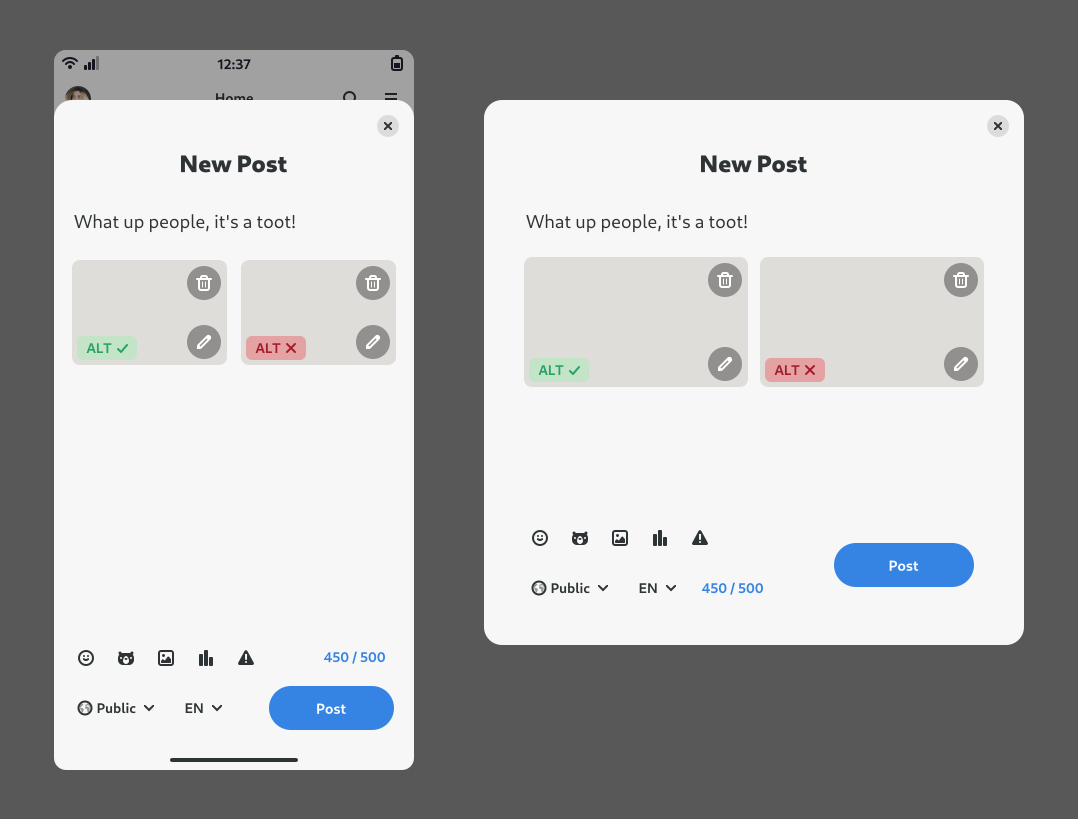
Perhaps we should be aiming straight for the new design by Tobias?

Tuba design mockup by Tobias

@bragefuglseth
Copy link
Contributor Author

For now, I agree that removing the view class from the text view looks the best 👍

@bugaevc
Copy link
Contributor

bugaevc commented Sep 24, 2023

Needs more polish, but something like this.

Screenshot from 2023-09-24 14-52-38

@GeopJr
Copy link
Owner

GeopJr commented Sep 24, 2023

In addition to this, the bottom toolbar should be added as a bottom child to the toolbar view, to make it integrate better with the content as well.

Won't go forward with this for now. There's a spacial case on the narrowest size that puts it on top due to the OSK & other issues with Phosh(? Mobile?) that prevent the dropdowns from poping up (#284, #65)

Needs more polish, but something like this.

Looks good so far! There are some cases the mockups don't take into account yet so it's probably best to wait:

  • For instances that allow > 4 media, should everything scroll or just the media section? what if there's also too much text? (multiple scrolled windows won't act nice on top of each other :/ )
  • Content warning entry, keep it as is or maybe a popover?
  • Polls
  • The buttons at the bottom will get crowded based on what items are active (polls = +4 buttons, media = +2 buttons)

(too early to answer them all probably but they are open)

I think we will probably follow elk.zone behavior wise 🤷

@bugaevc
Copy link
Contributor

bugaevc commented Sep 25, 2023

  • For instances that allow > 4 media, should everything scroll or just the media section? what if there's also too much text? (multiple scrolled windows won't act nice on top of each other :/ )

I was thinking everything'd scroll together. This is also something that ScrolledBin would be useful for, so maybe I should complete it. So we'd have

ScrolledWindow {
  Box {
    orientation: vertical;

    $ScrolledBin {
      GtkSource.View { ... }
    }
    FlowBox {
      $SomeMediaWidget { ... }
      $SomeMediaWidget { ... }
      $SomeMediaWidget { ... }
    }
  }
}
  • Content warning entry, keep it as is or maybe a popover?

Though it's not visible in the screenshot above, I have it as another top bar in the ToolbarView there. It #NeedsDesign though, @bertob please help us 😄

  • Polls
  • The buttons at the bottom will get crowded based on what items are active (polls = +4 buttons, media = +2 buttons)

I don't think I understand what you mean by these, please elaborate?

@GeopJr
Copy link
Owner

GeopJr commented Sep 25, 2023

I don't think I understand what you mean by these, please elaborate?

Continuing this issue on #553

Sign up for free to join this conversation on GitHub. Already have an account? Sign in to comment
Labels
enhancement New feature or request
Projects
None yet
Development

Successfully merging a pull request may close this issue.

3 participants