This repository has been archived by the owner on Apr 5, 2023. It is now read-only.
Final candidates #4
Comments
Sign up for free
to subscribe to this conversation on GitHub.
Already have an account?
Sign in.
Recipes
Debugmode.adoptedStyleSheetsis the starting point.shadowCSS()turns the CSS into a registerable dependency. To register it globally, you can registerStyleConfiguration.shadowDOM({ sharedStyles: [css] })in your app startup and that's also how you could expose CSS as a registerable plugin<use-shadow-dom>and@useShadowDOMis only needed for a CE don't want to follow a global setting.For app/plugin, you can just rely on the global shadowdom setting in your webpack config or gulpfile.
When your plugin is built, the information (use shadow dom) is baked into every CE. So that your plugin will always use shadowdom regardless of the user app (which uses your plugin) global setting.
The user app might turn off shadow dom, but that only affects the user local code. The CE from your plugin will still use shadow-dom.
IRippleEffectConfiguration) via DI.)Now, Any tracing-capable bundler can see that registration is either used or not used, and tree-shake it if need be, sample
We use this pattern a lot in v1.
To support the existing tag with or without value
Now we can change it a little:
Or use the new
setfeature.You can change from
to:
@bindable({ set: Number }) counterand simplified HTML
<el navigator>it means<el navigator="">it depends on how you want your API, another example is anything is true, except false string;
<my-el navigator="false">then you should have
An advanced example
atsmormdorlg)A11ycore
The general functionalities that we need during the project and of course can be used separately in other projects will be available in this package.
Ripple
Apply the ripple effect to HTML elements.
applyRippleEffect()
Scroll
Helps us to control scroll bars.
ScrollUp()/ScrollBottom()
bootstrap-v5-core
The whole config files that are related to Bootstrap v5 are here.
Just like
variantand so on.bootstrap-v5
All native Bootstrap v5 components (sometimes with more features) will be included in this package.
Accordion
at-accordion
With support Multilevel Accordion Menu
Alert
at-alert
With
Count downsupport.Aspect
at-aspect
Avatar
at-avatar
Badge
at-badge
Breadcrumb
at-breadcrumb
Button
at-button
With promise button support.
To feel clicking better you can add this as a config to remove outline when you are clicking.
Button Group
at-buttongroup
Button Toolbar
at-toolbar
With popover support
Card
at-card
Carousel
at-carousel
With responsive multi-items support like this
Also, support Vertical
Also, Slick
Close button
at-close
Collapse
at-collapse
And also, truncate functionality.
And With collapsible panel
Dropdown
at-dropdown
With hover support.
With tree support.
Embed
at-embed
Figures
at-figure
Support Image Hover too.
Float label
Bootstrap v5 supports floating labels but it does not look good with a very big design!
at-float or css mode
There are two different approaches to this.
Custom element. (High-order component)
Custom attribute.
Form
https://bootstrap-vue.org/docs/components/form
Support icons like this
And also spinners inside an input like this
Form Checkbox
at-checkbox
Form Color
at-color
Form Datalists
at-datalist
Form File
at-file
We should consider bs-custom-file-input too. (Supports drag & drop)
Also support Drop File style.
Form Group
at-form-group
Form Input
at-input
Form Radio
at-radio
Form Range
at-range
Form Select
at-select
Form Switch
at-switch
Form Textarea
at-textarea
Form Validation
https://v5.getbootstrap.com/docs/5.0/forms/validation/
We should support Bootstrap v5 form validation and integrate it with Aurelia 2 validation.
Image
at-image
Input Group
at-inputgroup
Layout and Grid System
https://bootstrap-vue.org/docs/components/layout
Link
https://bootstrap-vue.org/docs/components/link
List group
at-listgroup
It would be great if we support List Filter too.
Media
at-media
Modal
at-modal
This package should support a
ModalServiceto make components in the runtime too.Also, it should support fullscreen,
minimize,maximize, and other custom buttons.Support
window.confirm()andwindow.alert()override settings.Nav
at-nav
Navbar
at-navbar
With support
mega-menuin hover and clickable mode.And support multi-level menu or multi-dropdown-navbar
With also toggle animation
Pagination
at-pagination and at-pagination
With Bootstrap pagination features and abt-pagination
Popover
at-popover
An option to remove Popover arrow,
There are two different approaches to this.
Custom element.
Custom attribute.
Progress
at-progress
We should support the
gradient.Also suport Nanobar (separate component?!) with RTL.
And also vertical mode.
We should be able to provide circular progress bar too. (separate component?!)
OffCanvas
at-sidebar or side-modals
BottomSheetUse Bootstrap v5 Offcanvas with the below class
This can be an attribute to convert Sidebar to BottomSheet.
Spinner
at-spinner
Table
at-table
Tabs
at-tab
With support different alignments like bootstrap-tabs-x
It would be great if we support scrolling tabs too.
Toasts
at-toast
This package should support a
ToastServiceto make components in the runtime too.With
queue(prevent duplicates),newest on top,RTL, andprogress barsupport.Support different positions
Top Right,Bottom Right,Bottom Left,Top Left,Top Full Width,Bottom Full Width,Top Center,Bottom Center,Center CenterTooltip
at-tooltip
An option to remove Tooltip arrow,
There are two different approaches to this.
Custom element.
Custom attribute.
Scrollspy
at-scrollspy
There are two different approaches to this.
Custom element.
Custom attribute.
bootstrap-v5-plus
Complementary and non-native components that are compatible with Bootstrap v5 are included in this package.
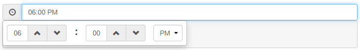
DateTimePicker
Use Day.js and Jalali Day.js for dates.
at-datetime
Consider this too
With support
date-rangelike Date Range PickerTextbox + Popover can help to design it!
Confirmation
at-confirmation
bootstrap-confirmation.min.js => 8.62 KB
Order List
at-orderlist
Password Box
at-password or at-password
Support password-meter and delayed password masking and also bootstrap-show-password-toggle
Spinbutton
at-spin
Choice
A more complete version of
at-select.at-choice
This works as an input tag (tokenizer) and also as an advanced select.
Should we choose Select2 and the BS5 Theme
select2.min.css => 15.9 KB
select2.min.js => 71.5 KB
select2.full.min.js => 75 KB
select2-bootstrap-5-theme.min.css => 28 KB
select2-bootstrap-5-theme.rtl.min.css => 27.9 KB
Jumbotron
at-jumbotron
Overlay
at-overlay
With this project features.
jquery-loading-overlay.min.js => 11.7 KB
Skeleton
at-skeleton
This library does not yet support
RTL.Rating
at-rate
Toggle
An alternative of [at-switch] with a different theme.
at-toggle
Slider
A more complete version of
at-range.at-slider
Timeline
at-timeline
Tour
at-tour
Dropzone
at-dropzone
Should we support this while we have
at-file?Barcode
at-barcode
QR Code
at-qrcode
Switch to qrcode-generator
Cropper
at-crop
Price Table
at-price
Pick List
at-picklist
Overlay Scrollbars
at-scrollbar
Stepper
at-stepper
Action Button
at-action
ScrollUp
Use
scrollfunctionalities in thecorepackage.at-scrollup
We need to be able to use multi instances.
Numpad
at-numpad
Textbox + Popover can help to design it!
News Ticker
at-news
With Bootstrap v5 theme support.
News Box
at-newsbox
Convert it (
Responsive-jQuery-News-Ticker) to vanilla js with Bootstrap v5 theme support.PropertyGrid
at-property
This should redesign with Bootstrap 5 and vanilla js.
Slide Menu
at-slidemenu
Calendar
at-calendar
It supports
Persianviafalocale.Drag & Drop
at-dnd
smooth-dnd.min.js => 35.3 KB
bootstrap-confirmation.min.js => 8.62 KB
Comment Box
at-comment
Poll
at-poll with statistics.
Support single and multi choices.
QueryBuilder
at-querybuilder
It should rewrite from scratch with Bootstrap 5 and vanilla js + support .NET as a server-side approach.
vanilla (A better name?!)
This section covers other components that are not necessarily related to Bootstrap and its theme.
CountUp
at-countup
Knob
at-knob
check pure-knob too.
Chart
at-chart
Photo Zoom
at-zoom
This should convert to vanilla js.
Divider
at-divider
Dom Outline
at-dom
This should redesign with vanilla js.
WYSIWYG Editor
at-htmleditor
Spreadsheet
at-spreadsheet
Splitter
at-split
Syntax Highlighter
at-highlight
Consider this implementation too.
Typed
at-typed
With support RTL direction.
custom-attributes
We will add our standalone custom attributes here.
Ripple
at-ripple
In this component we use
applyRippleEffect()inside thecorepackage.There are two different approaches to this.
Custom element. (High-order component)
Custom attribute.
Input Mask
at-mask
MaxLength
at-maxlength
Sticky
at-sticky
This will support ScrollPos-Styler and also the old
Bootstrap Affix.Lazy
at-lazy
icons
This package should support Bootstrap Icons as a first-class citizen. Finally, we are able to complete it too.
at-icon-*
Also, we support
spinkits. (Should be in a separate package?)at-spin-* like ng-spin-kit
services
We need some services such as:
ts-utils
Here are some useful functions that we use a lot.
persian-ts-utils
Persian utilities that are made by Typescript.
I made ts-persian-toolkit for this purpose.
ts-persian-toolkit.min.js => 6.20 KB
at-dependencies
If we have to depend on third-party JS/TS libraries we collect them in this section.
dashboard
We want to support different pre-defined layout for our users.
We want to design all possible layouts like Metronic + a blog layout
dashboard-cli
A CLI to create a different
dashboardimmediately.form-designer
An offline Electron-based application to create Aurelia-Toolbelt application with interactive (drag & drop) designer like Bootstrap Studio
Support Dynamic Form Generator (JSON Schema-based)
demo
We show here everything that has been prepared so far.
Our
e2e testingwill be based on this package.Irreplaceable jQuery-based components!
There is no good alternative for these components in vanilla js world! so we have to decide what to do about these.
The text was updated successfully, but these errors were encountered: