GitHub for Programming Project June 2015
Thomas van der Wardt
June 2015
Photovoltaic growth in the US: 2000-2015
The MIT License (MIT) Copyright (c) 2015, Thomas van der Wardt
In the directory 'Visualization', all script files are stored (JS, CSS, and HTML) which make up the webpage and contain the actual visualization. The data which is visualized is stored in separate directories, and is accessed by the scripts multiple times.
To be able to view the visualiztion, download both the 'Data' and the 'Visualization' directory, and host a server (e.g. a simple HTTPServer using python). Afterwards traverse to the Visualization directory in your browser, and webpage should open, containing an introduction, links to trigger drawing various visualizations, and references. Use Google Chrome to view this browser; this visualization has been fully tested in Google Chrome and therefore is only guaranteed to fully work in Google Chrome.
If you run into any problems trying to view this visualization, please e-mail me at [email protected] and I will respond as soon as possible.
Renewable energy resources, their usage, as well as national and international differences between usage, is a topic that has been visualized in many ways the last decades. Large organizations such governmental research institutes and consultancy firms have spent a lot of time in this field, in attempts to identify trends and growth of renewable energy.
Unfortunately, it seems that growth is mostly visualized in terms of total installed capacity, or amount of jobs in the renewable energy sector. I want to change this, and visualize the growth of renewable energy per US state based on a number of different parameters:
- State population (on 1-1-19XX or 1-1-20XX), total capacity divided by state population;
- "Growth" in terms of normalized costs per kW (based on installed panels);
- Growth of generated electrity per state based on average solar radiation per state;
The visualization will consist of the following different views:
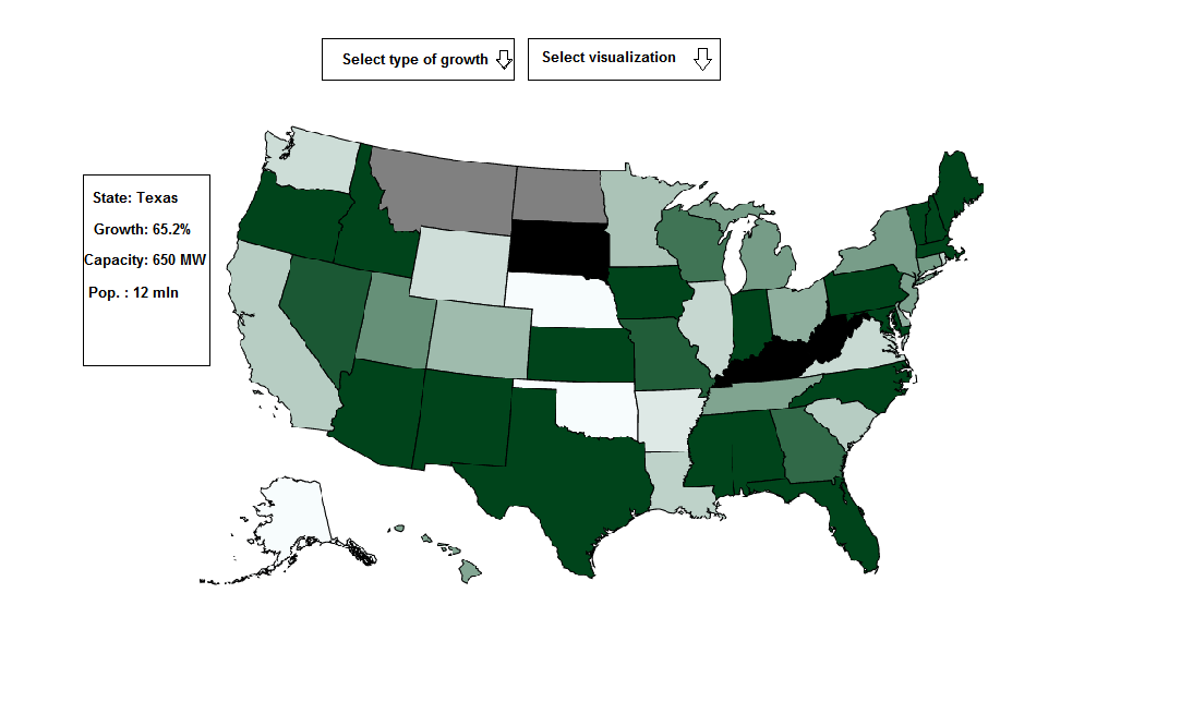
- US map, with a dropdown menu to select on which parameter to color the states (one of the above mentioned parameters), and an automatically changing date, increasing the date by year each time and therefore making this map animated;
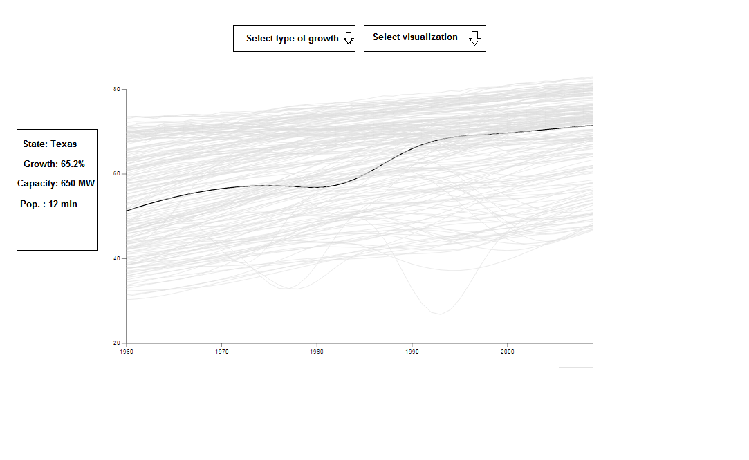
- Line graph, this graph can be triggered by clicking on a single state, showing the graph over time of the above mentioned parameters;
Altogether, this will mean that a lot of data must be found and bound to HTML elements using d3. Based on experience from the Data Processing course of the minor Programming at the UvA this visualization will be developed.
In the map "Visualization", the final product is available. It takes data from the map "Data", and uses several scripts which are stored in their respective maps inside the Visualization map.
The National Renewable Energy Laboratory has been working on their database with data on solar panels in the US since the beginning of the 21st century, and currently have more than 420,000 entries of installed solar panels in the US. The database is called 'The Open PV Project' and, as the name suggests, is a publicly accessible database.
Each solar panel that is entered into the database, has information on the State it is in, the Zipcode, the size (in kW), the cost of the total project, and the date it was installed. To have a go at looking through some of these entries, go to https://openpv.nrel.gov/search.
the US map will look like this:
The linegraph will look like this:
First week: US map drawing and coloring, data sets ready and checked of:
- per state population per date;
- per state normalized costs per date;
- per state generated electricity based on avg. solar radiation per year;
Second week: Interaction to go from geo-view to graph-view, with ability to select or deselect certain states and to change showed data.
Third week: If first and second week have succesfully been implemented, work on optional extra's. Else work on fixing problems that were encountered in the first or second week.
Fourth week: Fine-tune, cleaning all code, cleaning up GitHub. Prepare final version.
-
I have not worked with multiple scripts on a single page, this may cause problems to implement;
-
I have not worked with dropdown menu's to select through JavaScript, this may cause problems to implement;
-
Some data sets are so large that they may cause the script to run rather slow, this may cause problems in loading the visualization.
-
More detailed generated electricity for per state generated electricty based on avg. solar radiation, by not using a state average but by using a county average;
-
Map view of all solar panels of XXXX kW size shown as dots on the map;
-
Zoom-in functionality of the visualization in 2).
Other visualization also often use a map and color coding to visualize certain trends or growths, and linegraphs are also widespread. By making it possible to select and deselect certain states, and providing multiple 'types' of growth, the visualization will hopefully give new insights into the solar panels market in the US.
Data from:
- The Open PV Project;
- Census Population data;
- Solar radiation data from NREL;
- US.json from Mike Bostock.
Images from:
- California solar panels: Nellis Solar Power Plant: U.S. Air Force photo/Airman 1st Class Nadine Y. Barclay
- Solar panel installation: Dennis Schroeder/NREL