Proposal for a "height" axis ('hght') has been submitted. Please discuss in this thread. #14
Comments
|
In the Justification section, you say, Vendor commitments: Founder has a prototype version of YouHei with this axis, alongside Width and Weight axis. But per the proposal summary, you are not directly representing Founder. Can you get someone from Founder to respond here to confirm that they would like to ship multiple fonts that use this axis? |
|
@PeterCon |
|
@PeterCon |
|
Thanks, TangTing. I have edited the proposal summary to reflect your statement. |
|
Thanks a lot! @PeterCon |
|
The proposal mentions use of this axis for scripts that are commonly written vertically: Han, Kana, Mongolian, etc. This raises two questions in my mind:
|
|
Your question is dependent on a choice that: should we swap There may be three solutions:
|
|
Visualize in image...
|

|
This is name and definition is too broad to cover all scripts. I'd suggest its re-proposal as the script-specific y transparency axis it is. Thanks. |
|
@dberlow |
|
@dberlow @PeterCon
The “swapping” could be performed by this manner: for any tuple r, its weighting function being:
We need another tuple g with weighting function identical to:
So the new tuple become obvious:
Then, to represent
With some math trick...
Therefore, to perform such a swap we need to break an existing delta-tuple duplex into three duplexes: one with |


Those questions don't seem relevant for the variations axes; rather, to me, they seem relevant to text layout engine engineers. Eg, when you say,
Someone can make a demo using Amstelvar today (which has Latin and Chinese glyphs and axes) which does this.
|
|
@davelab6 : The questions raised are relevant for both: the definition of axes and for text layout engine implementations. Unless there is clarity about this for how axes are defined, then different font implementations can end up doing different things, and the layout engines won't have a way of knowing what to do. |
|
Just my opinion:
|
|
Basically I propose @be5invis solution (1) is highly preferable. |
|
@davelab6 |
|
@PeterCon @davelab6 @kenlunde
|
|
The XTRA and YTRA axes can prevent inconsistency because they can be
adjusted by their range, which is per-mille-of-em :)
|
|
For Latin, Xtra with ytra are what I’d use for maintaining a relationship between overall x and y in a proportional instance, and xtab and ytra are what I’d use for a monospace, or tabular instance.
For other world scripts, I recommend common use of xtra and xtab, with script-specific registered alignment axes, like ytch. We believe this and a full set of registered alignments, allow the flexibility to make instances with control over alignments of and between scripts.
…Sent from my iPad
On Dec 8, 2017, at 2:36 AM, Dave Crossland ***@***.***> wrote:
The XTRA and YTRA axes can prevent inconsistency because they can be
adjusted by their range, which is per-mille-of-em :)
—
You are receiving this because you were mentioned.
Reply to this email directly, view it on GitHub, or mute the thread.
|
|
@davelab6 @dberlow To some up the current ideas... |

|
You can look at Amstelvar today and see how it works today. It should be
more file size efficient but that is an implementation detail that doesn't
effect the typography or the axis definitions as proposed
…On Dec 9, 2017 7:37 AM, "Belleve Invis" ***@***.***> wrote:
@davelab6 <https://github.com/davelab6> @dberlow
<https://github.com/dberlow>
The xtra thing has a serious problem that, we do not have dependent axis
in fvar, so how would xtra co-exist with wdth? In the current situation
all design axes *should be* orthogonal, so for me I prefer wdth with some [0,
1] axes to do some precise control.
To some up the current ideas...
[image: image]
<https://user-images.githubusercontent.com/240091/33795658-aa6b7a24-dd20-11e7-861c-5099cd0499b5.png>
—
You are receiving this because you were mentioned.
Reply to this email directly, view it on GitHub
<#14 (comment)>,
or mute the thread
<https://github.com/notifications/unsubscribe-auth/AAP9ywQ6TRAIxm6DwE1vwF1N5x86uTwZks5s-n7wgaJpZM4QvT9_>
.
|
|
In Amstelvar, XTRA and wdth seem to coexist in the same way as any other gvar axes: if you set the wdth axis to the minimum, and then adjust the XTRA axis to the minimum, you break the text, because there's an additive effect between the axes. I think the idea of dependent or virtual axes is that it would be possible to have a higher level, non-gvar wdth axis that manipulates lower level XTRA and other gvar axes. The design space would be defined by the gvar axes, but instances could be defined along virtual axes through that design space. At the moment, we just have a flag that suggests parametric axes be hidden in UI, but I don't think that's sufficient to managing the relationships between axes. |
|
Are we just proposing axes here, or is the entire spec up for grabs?
…On Dec 9, 2017 2:47 PM, "John Hudson" ***@***.***> wrote:
In Amstelvar, XTRA and wdth seem to coexist in the same way as any other
gvar axes: if you set the wdth axis to the minimum, and then adjust the
XTRA axis to the minimum, you break the text, because there's an additive
effect between the axes. I think the idea of dependent or virtual axes is
that it would be possible to have a higher level, non-gvar wdth axis that
manipulates lower level XTRA and other gvar axes. The design space would be
defined by the gvar axes, but instances could be defined along virtual axes
through that design space.
At the moment, we just have a flag that suggests parametric axes be hidden
in UI, but I don't think that's sufficient to managing the relationships
between axes.
—
You are receiving this because you were mentioned.
Reply to this email directly, view it on GitHub
<#14 (comment)>,
or mute the thread
<https://github.com/notifications/unsubscribe-auth/AAP9yxpK14LWlaoEYVa_Wq2YyrIeuSgPks5s-uPBgaJpZM4QvT9_>
.
|
|
We're proposing axes, but in discussion I think we need to be aware that there are open questions about the relationship of axes that are likely to affect some proposals. For example, I'm really keen to get a basic set of x and y parametric axes registered, and think the Type Network proposal is a welcome step towards this and a good basis for building consensus, but the way I would like to use such axes requires a mechanism to be able to manipulate them via higher level, optical axes. I think it's inevitable, at least at this early stage, that discussion of new axes also involves discussion of the architecture into which they will be incorporated. |
|
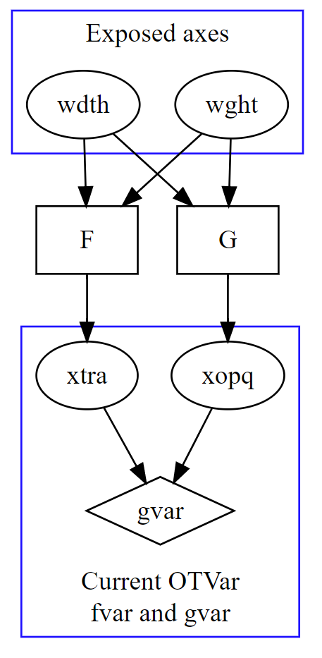
@tiroj So dependent axes could be an solution:
In this image To expose |
|
Up to you
…Sent from my iPad
On Dec 9, 2017, at 11:47 PM, Dave Crossland ***@***.***> wrote:
Are we just proposing axes here, or is the entire spec up for grabs?
On Dec 9, 2017 2:47 PM, "John Hudson" ***@***.***> wrote:
> In Amstelvar, XTRA and wdth seem to coexist in the same way as any other
> gvar axes: if you set the wdth axis to the minimum, and then adjust the
> XTRA axis to the minimum, you break the text, because there's an additive
> effect between the axes. I think the idea of dependent or virtual axes is
> that it would be possible to have a higher level, non-gvar wdth axis that
> manipulates lower level XTRA and other gvar axes. The design space would be
> defined by the gvar axes, but instances could be defined along virtual axes
> through that design space.
>
> At the moment, we just have a flag that suggests parametric axes be hidden
> in UI, but I don't think that's sufficient to managing the relationships
> between axes.
>
> —
> You are receiving this because you were mentioned.
> Reply to this email directly, view it on GitHub
> <#14 (comment)>,
> or mute the thread
> <https://github.com/notifications/unsubscribe-auth/AAP9yxpK14LWlaoEYVa_Wq2YyrIeuSgPks5s-uPBgaJpZM4QvT9_>
> .
>
—
You are receiving this because you were mentioned.
Reply to this email directly, view it on GitHub, or mute the thread.
|
|
I'm not sure I understand the question(s). Are you wanting to include additional axes in the 'hght' proposal? Just create two new proposals or a combined proposal for two axes and mention the 'hght' proposal as related. We can't change how 'wdth' is currently used or unregister it --- that has decades of legacy and existing implementation (e.g. it's tied to CSS font-width). More generally, axes that get registered could perhaps be deprecated but can't ever be unregistered. |
|
@PeterCon
Ideas from me and Ken is that, |

|
@PeterCon I'd like to update the proposal to add two more axes:
A frame-constrained glyphs is either:
In the other hand, |
|
I suggest you treat that as a new proposal with two axes, and reference the already-registered 'wdth' and proposed 'hght' axes as related. For a multi-axis proposal, I suggest you follow the pattern of the Type Network proposal, with an overview.md and then a separate proposal summary page for each axis. |
|
@PeterCon The description of |
|
Sure, makes sense. |
|
@be5invis I don't understand why you think these additional, frame-constrained axes are necessary. It seems to me that on the font side this is a design implementation of the wdth axis as it applies to East Asian glyphs, and on the layout side it is a text selection issue. If East Asian glyphs should not be subject to wdth adjustment, then font makers should not provide width adjusting deltas for them in the design space. If East Asian glyphs may be subject to wdth adjustment, but that width adjustment should not be applied in some layouts, then those characters should be excluded from application of wdth variation adjustment in those layouts. If you want to be able to apply variation to height and width of 'frame-constrained' glyphs independently of wdth and hght, I wonder if this is a sufficiently flexible mechanism (cf. earlier discussion re. script and language system independent variation), and also at what level the designation of frame-constrained category would take place?
Always? What about proportional CJK types? It seems to me that frame-constrained can't be reliably determined at the character level, so would we need a new GDEF category? |
|
@tiroj
|
|
Any font provider can provide whatever custom axes they would like. Registration, however, is for axes that will be broadly useful and broadly used. I would take John's comments as questioning whether these would be broadly useful and broadly used. |
|
Glyphs are ignorant about layout, which means that they have no way of knowing whether they're laid out horizontally or vertically, rotated or stacked. So we're already relying on a higher level protocol to know what the layout is and then apply features at the font level to specific glyphs or categories of glyphs appropriate to that layout. I'm not convinced that we need separate axes every time we want different categories of glyphs to have independent variation behaviour, or that registering new axes every time we come up with a problem with such behaviour is a sensible solution. Axes define the design space of a variable font; it doesn't follow that they define the UI to interact with that design space. So, for example, I can imagine software providing independent UI to apply hght and wdth on a script or language basis, using the same kind of character string analysis already necessary for determining aspects of layout behaviour. BTW, I wonder how Mongolian is expected to work in terms of nominal height and width variation? :) |
|
The other solution I can think of is that rather than introducing this new concept of frame-constrained glyphs, we could follow what we've done in OTL and have vertical-specific axes such that glyph adjustments are always relative to the display. So, for example the condensed rotated Latin on the left of @be5invis's illustration would not be a wdth adjustment but a vhgt (vertical height) adjustment. |
|
Leaving objections aside for the moment. If 'frame-constrained' glyph axes were to be registered and used, where do you envision the frame-constrained category being defined? |
You mean the Note that, introducing There could be another solution that, we write a huge |
I have a growing sense that some programmatic variation axes encourage that kind of implementation as font makers try to control which glyphs in a layout are subjected to variation. |
|
@tiroj Back to this proposed extension of
“All problems in computer science can be solved by another level of indirection.” |
|
Sum up solutions...
|
|
I think a lot of questions about how implement variable fonts and what axes need to be registered really hang on the larger question of meta-virtual-indirect-axis interaction, and until we've determined the architecture for that we're probably jumping the gun on proposing answers to those questions. |
|
"@dberlow If we'd like to break hght into multiple axes (like hhgt and vhgt), how about wdth? Should it be broken either?" That is what we've proposed. If Chinese has a dedicated axis to height, then it must have a dedicated axis for width. I don't know what "(like hhgt and vhgt)" stand for, but xtra and xtch give the technology the ability to adjust an instance to the y-transparencies independently of both the adjustment of other scripts and dimensions. "Height" I think, is just too broad a term and concept for an axis. |
The proposal is for a height axis, specifically for use in vertical layout, analogous to the width axis for horizontal layout. See the proposal details here:
https://github.com/Microsoft/OpenTypeDesignVariationAxisTags/tree/master/Proposals/Height_Axis
The text was updated successfully, but these errors were encountered: