Responsive Layout allows you to declare layout structures that will only be rendered in a specific screen-size breakpoint.
This app defines and exports four blocks:
responsive-layout.desktopresponsive-layout.mobileresponsive-layout.tabletresponsive-layout.phone
Each block has composition: children, which means that it expects to receive an array of children blocks for rendering if the current screen-size is right for its breakpoint.
- Import the Responsive Layout app to your theme dependencies in the
manifest.json. For example:
  "dependencies": {
    "vtex.responsive-layout": "0.x"
}- Add the
responsive-layoutblock to your theme. For example:
"store.custom#about-us": {
"blocks": [
"responsive-layout.desktop",
"responsive-layout.tablet",
"responsive-layout.phone"
]
},
"responsive-layout.desktop": {
"children": ["rich-text#desktop"]
},
"responsive-layout.tablet": {
"children": ["rich-text#tablet"]
},
"responsive-layout.phone": {
"children": ["rich-text#phone"]
},
"rich-text#desktop": {
"props": {
"text": "# This will only show up on desktop.",
"blockClass": "title"
}
},
"rich-text#tablet": {
"props": {
"text": "# This will only show up on tablet.",
"blockClass": "title"
}
},
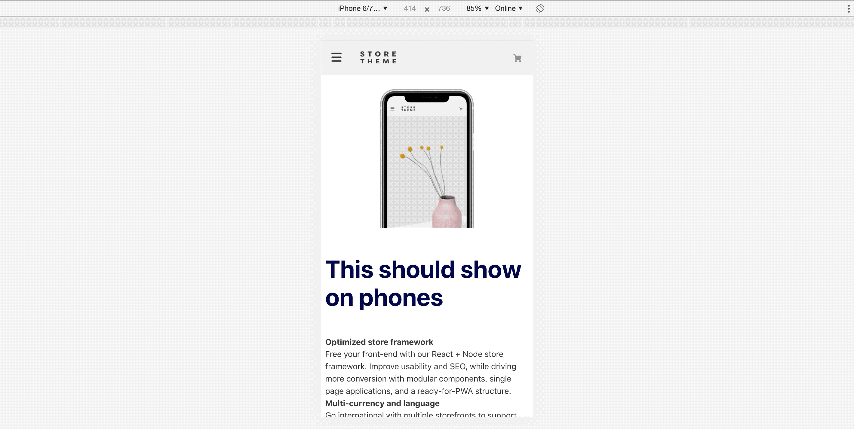
"rich-text#phone": {
"props": {
"text": "# This will only show up on phone.",
"blockClass": "title"
}
},Note that you could use any array of blocks as children, given that they are allowed by the block that is directly above responsive-layout.
Thanks goes to these wonderful people (emoji key):
 Micael Pereira 📖 |
This project follows the all-contributors specification. Contributions of any kind welcome!